Monday, February 28, 2011
Sunday, February 27, 2011
Section - Update
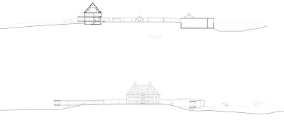
Straight out of CAD, thought you would like to see. Still need to add all the people, trees ect. and work it a bit.
Saturday, February 26, 2011
Friday, February 25, 2011
Wednesday, February 23, 2011
Project Drivers
Was trying to organize the points we'd want to make in the presentation/text and came up w a number of drivers:
SITE
Between the landscape, views and existing buildings theres enough site reasons for how we organized the program. Its not particularly conceptual strong or interesting, but it could be simply about respect for the site. Or better, it could be about activation of the site and buildings from a picturesque landscape into a dynamic, social zone/area/center of cultural productivity. Which kinda tiea into the second point.
PRODUCTIVE PRESERVATION
I think what we're doing is particularly interesting (back pat, back pat) because we're proposing a way to not only creat a new cultural center, but do so while preserving the existing landscape (by not building all over the prized parts) and highlighting the existing buildings. A new lease on life for the structures, so to speak. Its transformative by being protective/conservative (conservative as in act of conservation, not safe).
PROGRAM
Perhaps too much a variant of the REX gallery argument, but theres an argument to be made about independent, individual galleries and the simultaneous flexibilty and variety that they can provide. The project can host multiple, disparate shows or single large throughout shows. Important, though I dont think its a "this is what our project is all about first and foremost" kind of thing.
EXPERIENCE
This neither. But we should point out the oscillating relationship that the building and subsequently the user would have between the art, the landscape, and the square (courtyard? Square is more urban/active I guess).
Others?
And thoughts on what the main driver should be?
Section Cut | Elevations
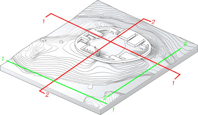
- Section 1 - Cut through entry (can move back and forth if necessary) looking towards manor.
- Elevation 1 - Looking at manor from lake. I think we should see the manor from both sides. (in initial list
- Section 2 - Cut through mid-point of manor and T2 (could looking in either direction, thought we could look this way so that we are consistent and have a view looking towards each of the four major directions.
- Elevation 2 - Looking at building from parking.
Will do basic cuts and post soon. Thoughts?
Tuesday, February 22, 2011
Production Schedule
-Dwg Plan
-Render Setup
2.THU FEB 24
-Dwg Plan
-Render Exterior 1
3.FRI FEB 25
-Dwg Plan
-Render Exterior 2
4.SAT FEB 26
-Dwg Site Plan
-Render Exterior 3
5.SUN FEB 27
-Dwg Elevations
-Render Interior 1
-Render Interior 2
6.MON FEB 28
-Dwg Sections
-Render Interior 3
-Render Interior 4
7.TUE MAR 1
-Diagrams
-Final Text
8.WED MAR 2
-Layout Boards
-Supplementary Documents (Program Spreadsheet?)
9.THU MAR 3
-Print/Mount
10.FRI MAR 4
-Pack/Ship
Monday, February 21, 2011
Sunday, February 20, 2011
Drawing List
1. Site Plan 1:500
2. Ground Floor Plan + Loading 1:200
3. Elevation at Manor 1:200
4. Elevation at Entrance 1:200
5. Section at Manor/T2 1:200
6. Section at Site Access 1:200
RENDERINGS:
1. Exterior - Aerial
2. Exterior - Entry (from Parking or Island)
3. Exterior - From Plaza to Lake
4. Interior - Gallery
5. Interior - Public Program (Restaurant or Lobby)
6. Interior - Path
DIAGRAMS:
1. "Productive Preservation"
2. Site Activation
3. Forest Path
4. 360 Views
5. Events / Uses
6. Curation
* 6 each is unintentional.
Saturday, February 19, 2011
Thursday, February 10, 2011
Sketch - Site Cirulation


I think this site circulation, including loading, will work. It will require a core at the Admin for both public and freight since the ring circulation has to pass above the loading before dropping down to the T1 floor level. On the other side, there is possibly enough length to ramp from the T1 floor level (+102) to the plaza level (+107) with a 1:20 ramp (no handrails, no landings req). Collections will be at +106, midway up the ramp, which is actually more native to the existing site elevations.
Also looking at splitting the ring at the big gallery as opposed to growing it, but not sure if it looks so good yet. Will continue to look at that back area when I am in San Diego.
Wednesday, February 9, 2011
Monday, February 7, 2011
Saturday, February 5, 2011
Friday, February 4, 2011
Thursday, February 3, 2011
Circ/Plaza/Site/museum

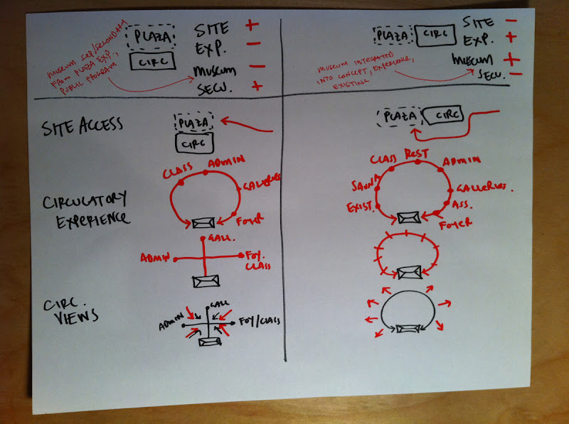
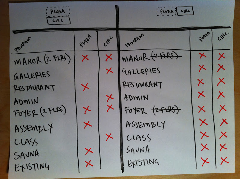
These don't really show all that much, just trying to get ahold of it. When it comes down to it, I think the difference between circulation at plaza level vs below plaza level is whether to privilege the site or the museum.
Circulation below the plaza = Pro Site.
Circulation at plaza = Pro Museum.
Goin home.


