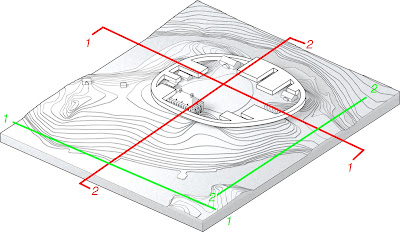
This is what I'm thinking for sections/elevations.
- Section 1 - Cut through entry (can move back and forth if necessary) looking towards manor.
- Elevation 1 - Looking at manor from lake. I think we should see the manor from both sides. (in initial list
- Section 2 - Cut through mid-point of manor and T2 (could looking in either direction, thought we could look this way so that we are consistent and have a view looking towards each of the four major directions.
- Elevation 2 - Looking at building from parking.
Will do basic cuts and post soon. Thoughts?
Yes I think good. The only adjustment Id make is for Section 1 to kink/step so that it goea trough the entrance in the NW corner, towards the bridge. Its important to emphasize the flow-through nature of the scheme.
ReplyDeleteActually, Id also keep the sections and elevations facing in the same direction (north and west). We'd describe less, but it will be more logical when looking at te drawings. And helpful that youll be able to line up things, like the manor in sect and elev 2.
Rad.
Sorry for the typos. Fingers too fat for the phone.
ReplyDelete